xzenar
Posts : 5
Join date : 2009-09-20
 | |
Sudo

Posts : 39
Join date : 2009-08-23
Character Information
Name: Lomein
Class: Druid
Proffesions: Skinning, Leatherworking
| | Subject: Re: Hi, plz check this and leave a comment Thu Oct 22, 2009 10:37 am | |
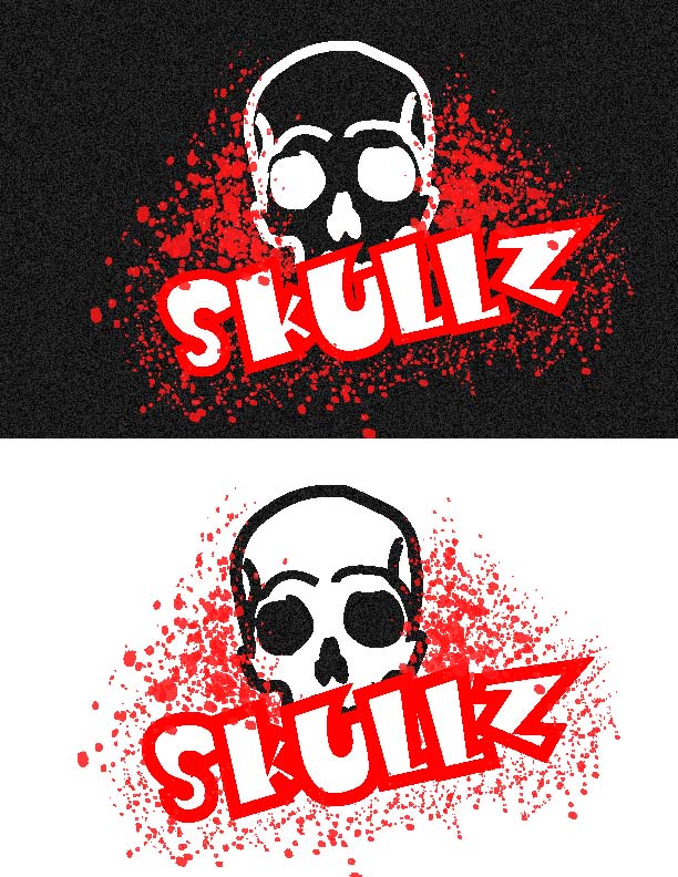
| I'd fix the letters "S", "K" and "Z" somehow to look a bit nicer/cooler. | |
|
iir
Posts : 123
Join date : 2009-08-23
Character Information
Name: Iir
Class: Paladin
Proffesions: Mining/Ench + JC/BS
| | Subject: Re: Hi, plz check this and leave a comment Thu Oct 22, 2009 10:39 am | |
| Well overall I dont think you need to start over. Personally I prefer the dark version a lot better. First tho, the skull looks a bit scared to me, maybe some redesign there. Secondly I dont think the font is too 'skate'. Perhaps some graffiti-like font would work better for the topic  Good luck. | |
|
vafflan22
Posts : 4
Join date : 2009-10-18
| | Subject: Re: Hi, plz check this and leave a comment Thu Oct 22, 2009 10:44 am | |
| I think it looks great, very skate-stylish ! I prefer the dark one, and I think the S looks a bit weird aswell.
But overall, nice design. | |
|
Lynqoid
Admin

Posts : 292
Join date : 2009-08-03
Age : 37
Character Information
Name: Lynqalot
Class: Warrior
Proffesions: Engineering/Mining
| | Subject: Re: Hi, plz check this and leave a comment Thu Oct 22, 2009 2:42 pm | |
| Maybe smoothing out the S a little bit and making it bigger would be awesome, like...
Skulls instead of skulls or...
SKULLS
The Dark one i do prefer depends what it looked like on a t-shirt a white t-shirt with the design on would like pwnzor as well! | |
|
Sponsored content
| | Subject: Re: Hi, plz check this and leave a comment | |
| |
|